
A series of motion design studies crafted to explore creative techniques, storytelling, and visual styles.
Scroll to view ↓
Tiffany & Co. Holiday Spec Project
Overview
This was a personal motion design experiment inspired by Tiffany & Co.’s 2024 holiday campaign With Love, Since 1837. The campaign, set in a snow-covered Manhattan, highlighted Tiffany’s heritage and timeless elegance. My study focused on one key image from the campaign: a diamond ring with ribbons and snowfall.
Why This Brand / Aesthetic
Tiffany’s visual identity has always interested me because of its balance of luxury and simplicity. The brand communicates through understatement, using a minimal palette, subtle details, and the instantly recognizable Tiffany blue. I wanted to see how these qualities could be translated into animation while keeping the same sense of refinement.
Process / Software
I sourced the ring from an asset library and modified the model to fit the visual direction I wanted.
Simulated snowfall and fabric dynamics to echo Tiffany’s seasonal campaign mood.
Focused on lighting and reflections to emphasize the diamond’s brilliance against the Tiffany blue backdrop.
Treated the study as a vignette, exploring how motion could carry Tiffany’s sense of elegance into time-based media.
Made in Cinema 4D + Redshift
What I Learned
This study taught me that simplicity, while being detailed, is what carries Tiffany’s aesthetic. The pace of falling snow, the drift of a ribbon, and the sparkle of a reflection all contribute to the brand’s sense of timelessness. Motion design gave me a way to explore how elegance can be extended into time and space.
Production Stills


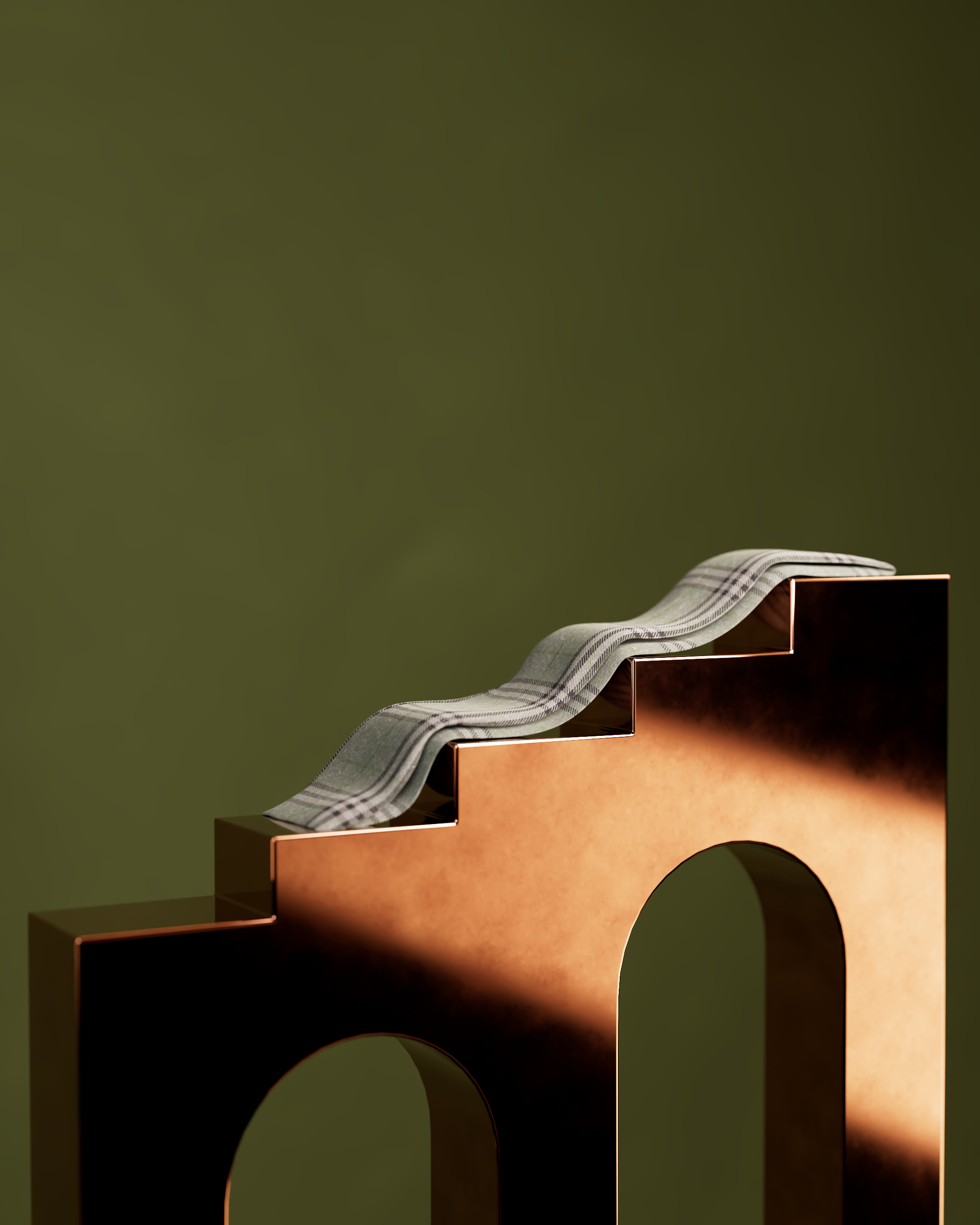
A Burberry check scarf flowing across copper steps, a blend of soft textiles and rigid geometry to highlight the brand’s balance of heritage and modernity.
A continuous pan across Burberry’s check fabric as it moves like cloth, revealing folds and shadows in motion.

Burberry’s check pattern rendered as draped fabric, with metallic spheres rolling across its folds to emphasize levity, texture, and movement.
Burberry Motion Concept
Overview
This was a personal motion design experiment where I reimagined Burberry’s iconic check pattern in three-dimensional space. The goal was to bring the pattern to life through material, geometry, and light, creating imagery that balances the brand’s heritage with a modern edge.
Why This Brand / Aesthetic
Burberry’s check is one of the most recognizable symbols in fashion. I was drawn to it because of its duality: a textile rooted in tradition but constantly refreshed in contemporary campaigns. I wanted to explore how the check could be transformed beyond fabric into sculptural, architectural, and reflective forms, while still retaining its sense of refinement.
Process / Software
Designed a few check patterned assets and turned them into fabric, staging the items on rigid surfaces, heavily focusing on color palette and lighting.
Wrapped a wallet in the check pattern and balanced it on copper architectural steps, creating a symbiotic relationship between the two.
Explored how Burberry’s visual identity could exist in both flowing and architectural contexts by blending cloth with minimal geometry.
Made in Cinema 4D + Redshift
What I Learned
This experiment taught me how a brand identity as established as Burberry’s can still be reinterpreted through materiality and context. A pattern on fabric communicates heritage, while the same pattern on polished geometry communicates innovation. Balancing those two elements made me realize how motion design can preserve a brand’s legacy while imagining its future.

A Burberry wallet balanced on copper steps, its check pattern contrasted against geometric architecture with rays of light entering the frame.
Soft vs Hard Motion Studies
Overview
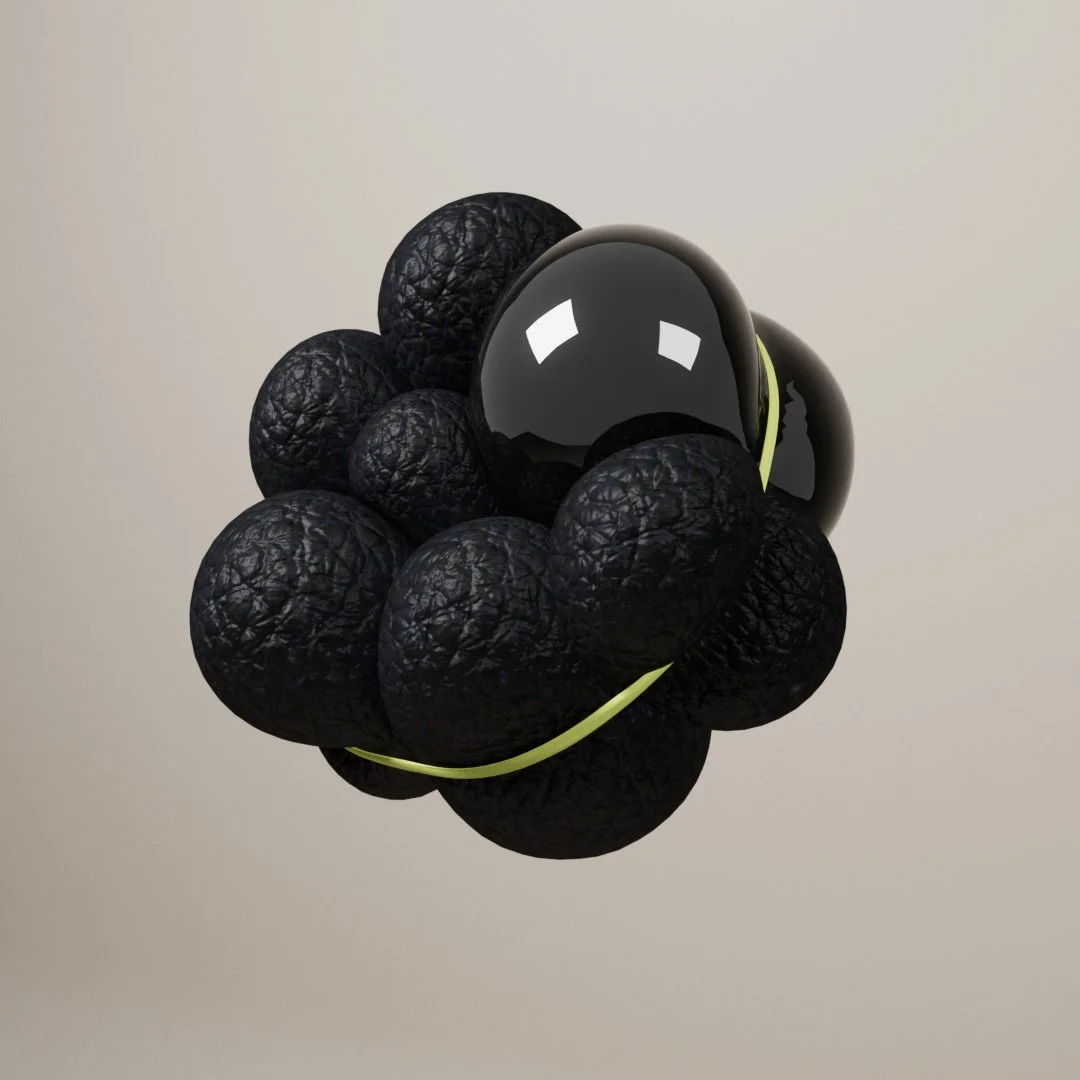
This motion design exercise explores the tension between softness and rigidity. I set out to create visually appealing images by simulating the physics of inflated, balloon-like forms held in place by hard metallic structures. The work is less about narrative and more about testing how material contrast can shape perception.
Concept
I was interested in how digital physics can make abstract objects feel tactile. By pairing soft, inflated shapes with rigid golden rings, I explored the boundaries between fragility and structure. The shadows cast by the forms became part of the composition, introducing another layer of movement and interplay between hard and soft.
Process / Software
Modeled clusters of rounded, balloon-like forms with smooth surfaces.
Introduced gold metallic rings as rigid counterpoints, pressing into or framing the softer volumes.
Experimented with lighting angles to generate elongated shadows that emphasize the forms dimension.
Rendered close-ups and wide views to highlight both the physical interactions and the sculptural quality of the compositions.
Made in Cinema 4D + Redshift
What I Learned
This study reinforced how powerful simple contrasts can be: soft versus hard, matte versus reflective, organic versus geometric. The project showed me how digital simulations can evoke a sense of touch and weight, even in purely abstract compositions. It also reminded me that beauty often emerges from restraint — a few well-chosen elements can suggest far more than a crowded frame.


Soft balloon-like forms held in tension by a golden ring, their shadows weaving across the surface.

I treated this render as a study in material contrast, exploring how the heaviness of marble could be reimagined as soft, balloon-like forms.

Close-up of inflated geometry pressed against a gold ring, emphasizing texture, curvature, and contrast.
I approached this render as a study in athletic tension, inspired by the textures and resilience found in sportswear and performance equipment.
Voyage d’Hermès Motion Study
Overview
This was a personal motion design project inspired by Hermès’ fragrance Voyage d’Hermès. I designed the ad in black and white, focusing on atmosphere and restraint. The fragrance bottle floats between two stones, set against an out-of-focus background, while its signature cap spins slowly around it. The goal was to capture Hermès’ balance of elegance and simplicity through minimal but deliberate motion.
Why This Brand / Aesthetic
Hermès appeals to me because their design language communicates refinement without excess. Voyage d’Hermès is about travel, lightness, and poetic movement, and I wanted to see how those qualities could be distilled into a clear visual sequence. Black and white allowed the form, reflections, and motion to stand on their own, without distraction.
Process / Software
Built a 3D model of the fragrance bottle and placed it between two stone forms.
Designed the scene in black and white to emphasize contrast, light, and shadow.
Animated the bottle’s cap to rotate, highlighting the design’s unique movement.
Blurred the background to keep focus on the bottle while creating depth and atmosphere.
Made in Cinema 4D + Redshift
What I Learned
This project showed me how much power minimal motion can have in shaping tone. The slow spin of a cap, the stillness of floating stones, or the softness of an out-of-focus background can communicate elegance more effectively than elaborate simulations. Working in black and white helped me focus on form and movement, and gave me a deeper appreciation for Hermès’ use of restraint.
Production Stills

